A website is often the first place people go when they want to learn about a business. They may find you through Google, LinkedIn, an email, or a recommendation. Once they land on your website, you have only a short time to show them that they are in the right place.
This is where website design matters.
A good website is not only about colors, animations, or having a modern look. It should be easy to use, easy to understand, and make it simple for visitors to take the next step.
At BinaryGrace, we work with businesses on website design and development, and we often see the same problems come up. Some are small, while others can have a direct impact on leads.
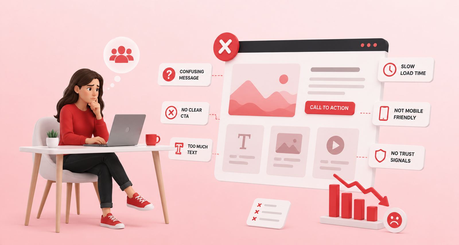
Here are 10 website design mistakes worth checking on your own website.
1. Your homepage doesn’t explain what you do
One of the most common problems is a homepage that looks nice but doesn’t clearly explain the business.
When someone visits your website, they should quickly understand:
- What does your company do?
- Who do you help?
- What services or products do you offer?
- Why should they choose you?
For example, instead of saying:
“We create digital experiences for modern businesses.”
you could be more direct:
“We design and develop WordPress websites for growing businesses.”
The second version gives visitors a much better idea of what you actually do.
2. There is no clear call to action
Imagine a visitor likes your website and wants to speak with you. What should they do next?
If the answer isn’t obvious, you may lose the lead.
Your website should have clear actions such as:
Get a Quote
Book a Call
Request a Consultation
Contact Us
View Our Work
The right call to action depends on your business.
You also don’t need to place a button everywhere. A few well placed calls to action are usually better than filling every section with buttons.
3. The homepage is too crowded
Some businesses try to put everything on their homepage.
Services, company history, every feature, 20 client logos, long paragraphs, multiple offers, awards, videos and more.
The result can be overwhelming.
Your homepage doesn’t need to tell your entire company story. Its job is to help visitors understand your business and guide them to the information they need.
Keep the most important information easy to find.
If someone wants to learn more, they can visit your About, Services, Case Studies or Contact pages.
4. The website doesn’t work well on mobile
A website might look perfect on a large desktop & laptop screens but feel completely different on a phone.
Text can become too small. Buttons may be difficult to tap. Images can get cut off. Sections may take too long to load.
These small issues can make someone leave.
A good website design should work across different screen sizes, including:
- Mobile phones
- Tablets
- Laptops
- Desktop computers
Before launching a website, don’t just check the desktop version. Spend some time using it on your phone as a real visitor would.
5. The website is slow
Nobody likes waiting for a website to load.
Large images, unnecessary plugins, too many scripts, poor hosting and unoptimized code can all affect website speed.
Speed also matters beyond user experience. It can affect how people interact with your website and how search engines evaluate the overall experience.
You don’t have to remove every image or animation from your website. The goal is to use them carefully and make sure they are properly optimized.
Simple things such as compressing images, removing unnecessary plugins and optimizing scripts can make a noticeable difference.
6. Your content is too generic
This is something we see quite often.
A website says:
“We provide high-quality solutions for businesses.”
But what does that actually mean?
Visitors want to know what you do and how you can help them.
Instead of filling your website with general statements, talk about real problems your customers have.
For example:
“We help B2B companies redesign outdated WordPress websites and create a faster, easier experience for their customers.”
That’s much easier to understand.
Good website content doesn’t have to sound fancy. It just needs to sound like a real business talking to a real customer.
7. There are not enough trust signals
People are careful about who they give their money and time to.
Even if your service sounds good, visitors may still wonder:
“Can I trust this company?”
Your website can answer that question with simple trust signals.
You could include:
- Client testimonials
- Case studies
- Previous projects
- Client logos
- Reviews
- Certifications
- Years of experience
- Team information
- Clear contact details
You don’t need to add everything.
Choose the proof that makes sense for your business and show it where visitors are most likely to need it.
For example, a testimonial near your contact form can help someone feel more comfortable reaching out.
8. The design feels inconsistent
Your website doesn’t need to be complicated to look professional.
But it should feel consistent.
Using five different fonts, random button styles, different heading sizes and unrelated colors across pages can make the website feel unfinished.
A simple design system can help.
Choose a small set of:
- Fonts
- Colors
- Button styles
- Heading sizes
- Spacing
- Image styles
Then use them consistently across the website.
This makes the site easier to use and gives your brand a more professional feel.
9. Contacting you is harder than it should be
This sounds obvious, but it happens surprisingly often.
A visitor is ready to contact you, but they can’t find your phone number, email address or contact form.
Or the form asks for too much information.
If you want more enquiries, make the process simple.
Your contact page should clearly show how someone can reach you. If you use a form, only ask for information you actually need at that stage.
You can always collect more information later.
Also make sure your contact forms work properly. A great website won’t help if a potential enquiry disappears because the form was broken.
10. The website is designed to look good instead of work well
A beautiful website is a good start.
But a website should have a purpose beyond looking good.
Visitors should be able to find information, understand your services and take action without having to think too much.
How to know if your website needs improvement
Take a few minutes and look at your website as if you were visiting it for the first time.
Ask yourself:
- Can I understand what this company does within a few seconds?
- Is it obvious who they work with?
- Can I easily find their services?
- Is there a clear next step?
- Does the website work well on my phone?
- Does it load quickly?
- Is there enough proof that the company can be trusted?
- Can I easily contact them?
Final thoughts
Your website doesn’t have to be perfect to generate leads. But it should make things easy for the people visiting it. Clear content, simple navigation, good mobile design, fast loading pages, trust signals and strong calls to action can make a big difference.
At Binary Grace, we believe website design should start with the people using the website not just how the website looks.
A website should not just tell people about your business. It should help them take the next step.